Antique Accessories

Who is Giorgio Vigna?


Born in 1955 in Verona, designer and artist Giorgio Vigna is known for his use of glasswork and his multiple collaborations with Venetian glassmaker Venini, which have resulted in a number of unique objects as well as Venini’s first glass jewelry collection, Talismani, in 1998. Vigna also created Iittala’s highly successful glass Birds collection in 2007 and designed the company’s first jewelry collection, Piilo Amulet in 2010.

Vigna first worked as a stage designer in the 1980s in Rome, before moving his studio to Milan in 1990, where he is still based. Much of his inspiration comes from nature, “water, fire… micro and macro cosmos… lightness and heaviness,” the artist said, adding he doesn’t distinguish between his jewelries and sculptures, seeing the former as a “continuation as they are all part of a single cosmos.”

Vigna’s jewelry creations was highlighted at Miami Design/ Basel, with Elisabetta Cipriani dedicating a large part of her booth to the Italian creator with 30 unique pieces available as expressions of the diverse disciplines he works with: the virtues of glass, jewelry as sculpture, and the soul of the precious. A section of the exhibition was dedicated to Sospeso (suspended), the first jewelry project of rings and pendants he created in collaboration with Elisabetta Cipriani in an edition of five and as an homage to his Sospeso sculpture that had been commissioned for the “TRA. Edge of becoming” exhibition held at the Fortuny museum, in 2011, during the 54th Venice Biennale.

“What makes Giorgio Vigna’s work unique is his incessant experimentation with different medium, bringing back his artifice to a natural state,” notes London based gallerist Elisabetta Cipriani pointing to his investigation of materials such as glass, metals, and paper.

His work is constantly developing, straddling art and design. Vigna explains he was probably attracted to jewelry design because his maternal grandfather had a goldsmith’s workshop.

Asked about his recurrent use of glass and the appeal of the material Vigna says “Glass is like water that has been captured, its unstoppable flow suspended for a moment in time.”

Vigna goes on to say “In each new exhibition, and especially for this one with Elisabetta Cipriani gallery in London there are always new developments of my artistic universe, but also pieces never seen before that are always part of this universe and come to light on this occasion,” the artist notes his inspiration came from “the element of water and glass, sand… handmade Murano glass, gold leaf… from water to rock, a journey into a new cave just discovered in a distant planet.”

We are pleased to present our collection of Vignas’ work here at the Antique Warehouse.  These piece were acquired in Paris and brought to Vancouver.

.

Light as a feather yet created out of silver, sand, and crystal this beautiful necklace is perfect for the Holiday Season. Look under new arrivals to see more of Vigna’s work. Available in time for Christmas.


How Antiques Amp Up a Contemporary Space.

This week on the premier website 1 Dibs, an article was published “How Antiques Amp Up a Contemporary Space”. I’ve pulled the article and reposted on my website. The writer is Cara Greenberg and here is her article below. But I’ve been saying this for years now, and really any good interior designer or decorator already knows this.

How Antiques Amp Up a Contemporary Space.
By Cara Greenberg.

Antiques add drama — and ­more than a little gravitas — to contemporary interiors. Top talents reveal how they pull off the balancing act.

Call it the X factor: the unexpected juxtaposition of decorative elements that lifts a contemporary interior out of the ordinary and makes people sit up and take notice. Often, it’s the insertion of one or more well-chosen antiques, thoughtfully deployed against the clean lines of contemporary furnishings, that makes the whole setting pop. “Antiques are the element of surprise in a contemporary space,” says Los Angeles– and New York–based interior designer Alexandra Loew.

Alexandra Lowe

Alexandra Lowe

“Antiques are a great foil to chic-but-clinical newness,” is how James “Ford” Huniford, of Huniford Design Studio in New York’s Greenwich Village, puts it. “They can keep a contemporary interior from looking like a sterile showroom.”

James Huniford

James Huniford

It wasn’t until the last few decades of the 20th century that mixing styles and periods became acceptable, and then de rigueur. Prior to that, people lived with whatever was, for them, modern in its truest sense — “of the moment,” whether the moment was Louis XIV, Colonial or high Victorian. The early 20th century saw revivals of classical styles, the birth of the modernist movement and the swoops and amoeboid shapes of the immediate postwar years. By the 1960s, when the typical contemporary room was white and spare, with furnishings predicated on the right angle, some design mavericks began bringing in Tiffany lamps and bentwood rockers to leaven the mix.

Antique Accessories

This lovely Louis XVI Console is just at home in a contemporary setting as in a classic. Only this one was produced in France and has an enduring look and quality that will last for decades.

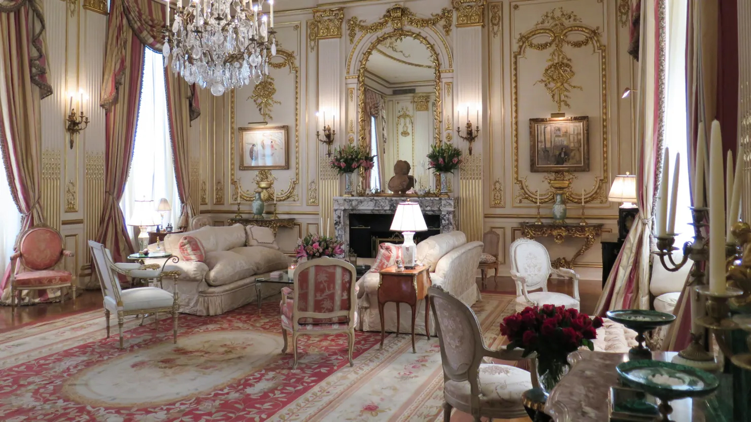
Today, with websites making global shopping possible, the whole of decorative-arts history is fair game for those seeking to create interesting interiors, which can incorporate every style and period from antiquity to the present day. But a delicate balancing act is required. Many top designers selectively use antiques in otherwise contemporary settings to add drama and enliven their schemes. Examples of this are located on our ‘inspiration’ page of our website.

Antique Accessories

Louis XVI chairs like these were sold by us to Interior Decorator Superstar Nate Berkus who used them in one of his design projects just this past year.

Antique Accessories

I love the use of the bureau bookcase and the 60’s maison bague style table in this modern bathroom.

Antique Accessories

This beautiful French Farm table makes this contemporary space look simple and elegant.

So you have it. Mix an antique for drama and style. But you and I already knew that-

Thanks for reading!

Mark LaFleur
226 SW Marine Drive,
Vancouver, B.C.
Please visit our website

We ship worldwide.